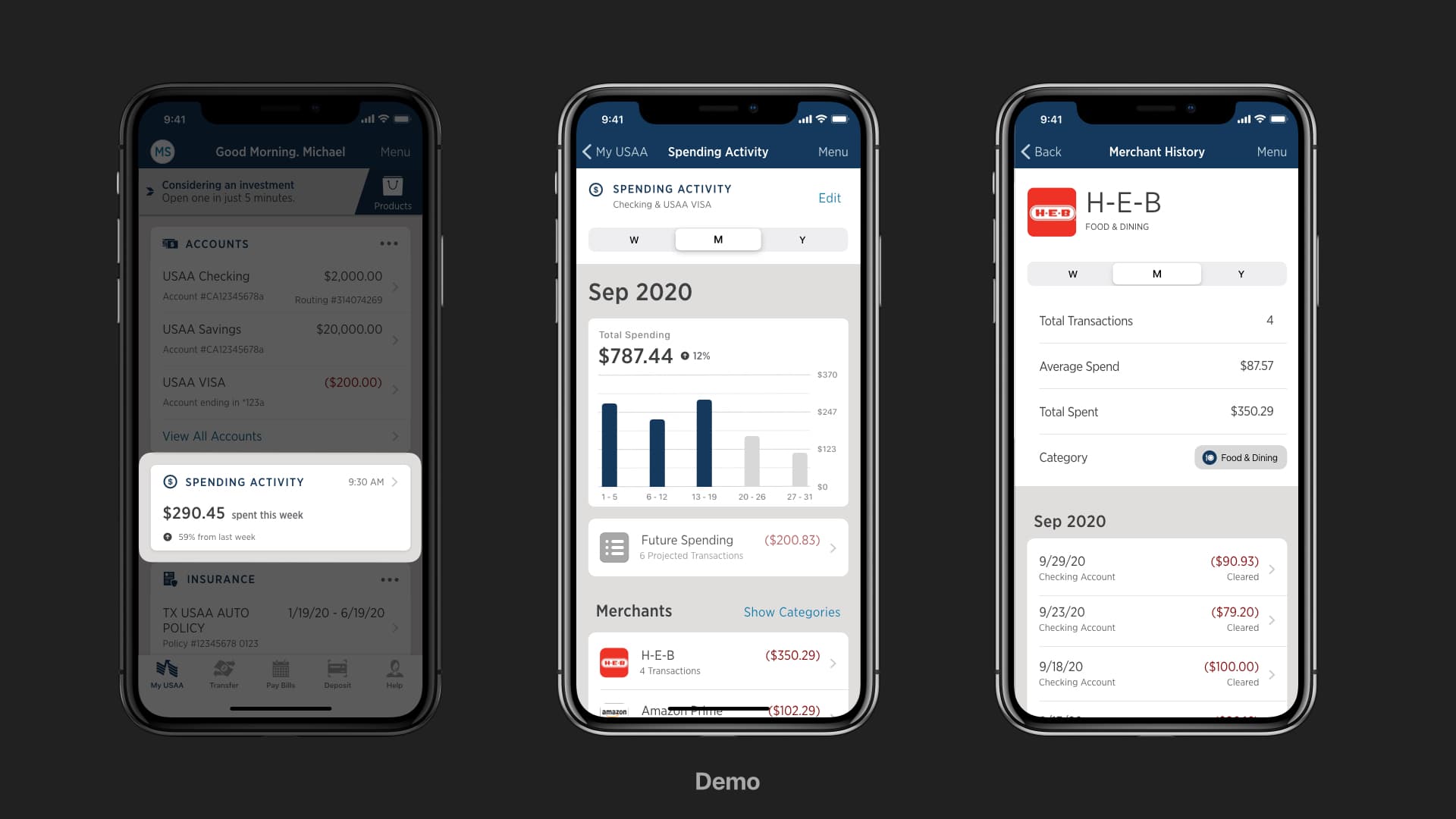
Selected work
01

USAA · FINANCIAL WELLNESS

From hackathon signal to a financial decision platform

Members had plenty of financial data. What they lacked was a clear, timely explanation of what it meant—and what to do next.

ROLEDesign strategy lead · Team leadership
SCOPEPersonalization · Native mobile · Data orchestration
CONTEXTHackathon concept → pilots → production roadmap
600+research participants
500Kmembers per control group
$5Mestimated annual pilot benefit
34.5%lift in savings-booster enrollment

A successful insight library had outgrown the home screen.

USAA already had dozens of useful personalized messages, but the experience was constrained to a few high-traffic “zones.” Urgent alerts, life events, financial education, and product guidance competed for the same limited space.

The deeper issue was not screen real estate. A chronological account view showed transactions, but it did not help members recognize patterns, understand financial health, or build better habits.

How might we turn scattered financial signals into an experience that helps members understand, decide, and act?
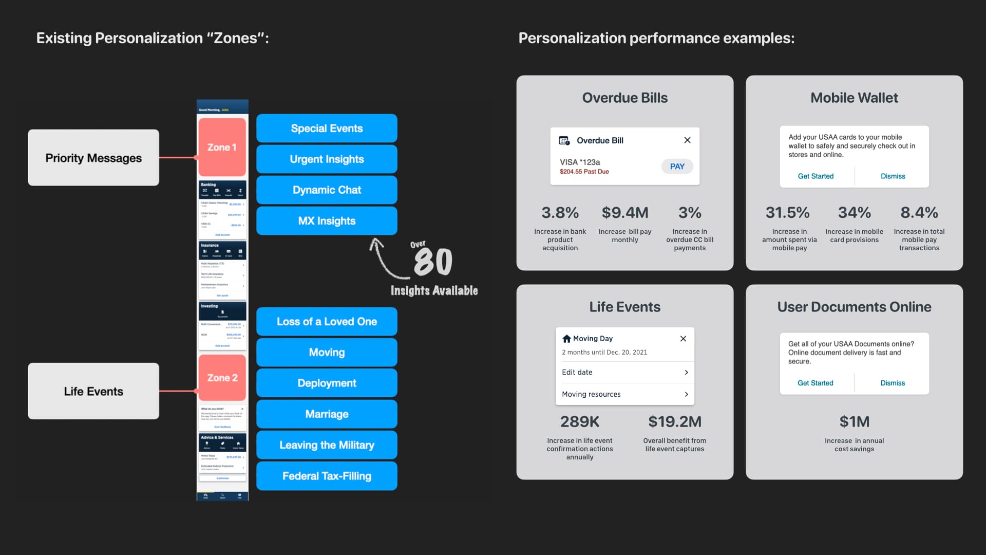
Complete slide mapping existing personalization zones, including priority messages, insight cards, life events, and prior performance examples
The complete source slide preserves the existing ecosystem—including the Life Events pattern that was missing from the earlier crop.

Build the business case and a path that teams could actually ship.

I managed the Personalization design team across discovery, strategy, research, and delivery. With our Product Owner, I helped reframe the effort from “a new feed” into a financial-health orchestration capability.

The decision had to balance member value, Advice and Bank priorities, native-platform feasibility, data readiness, compliance, and a large change in how insights were assembled and delivered.

My accountabilityProblem framing, design direction, team operating rhythm, research program, executive narrative
Key partnersProduct, Bank, Advice, Data Science, Analytics, Engineering, Risk, Compliance, Accessibility

I made the decision model visible before we made the interface.

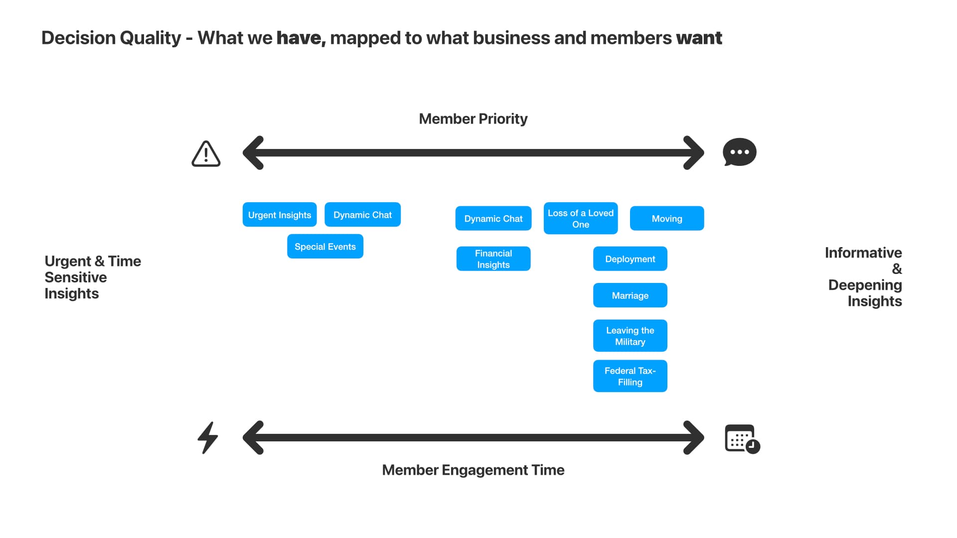
I mapped the insight portfolio across two meaningful dimensions: urgency and the effort a member was likely to invest. This separated quick, time-sensitive guidance from deeper financial learning and created a shared language for prioritization.

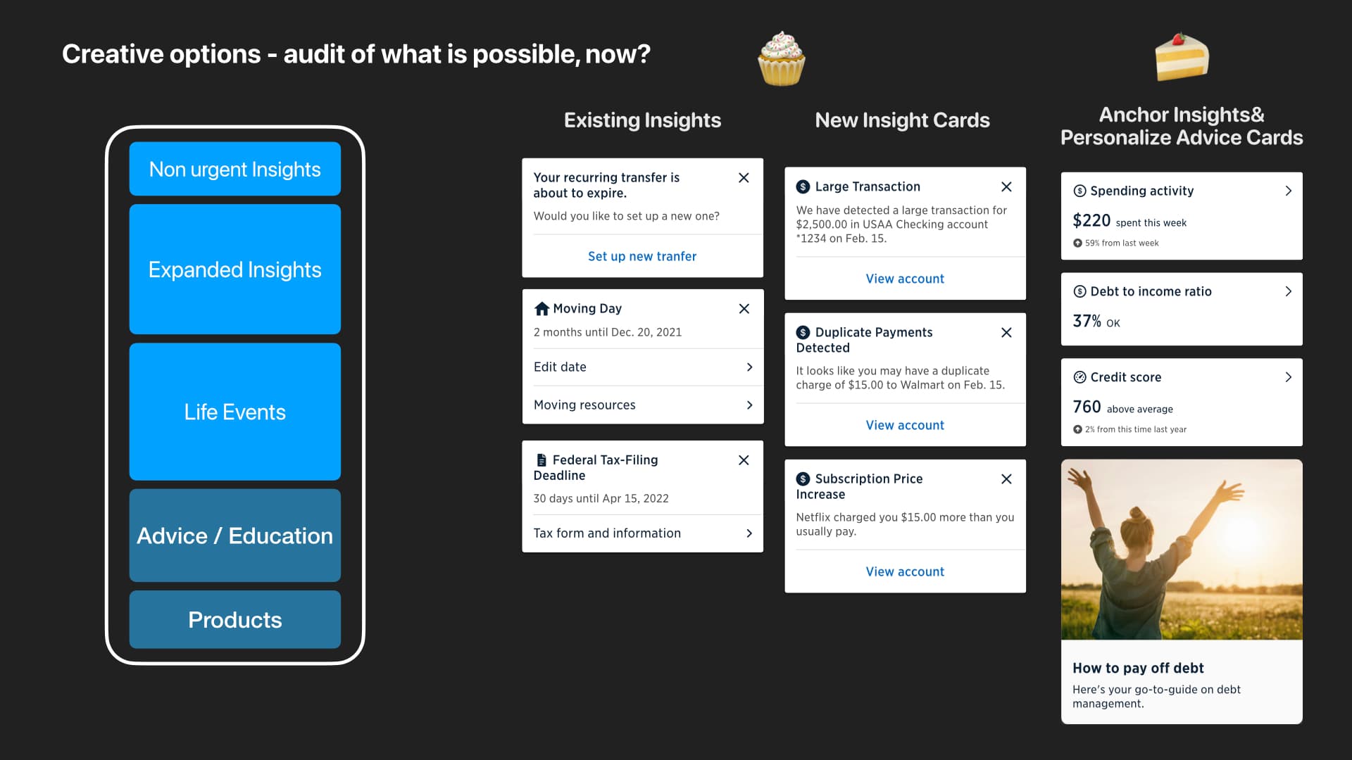
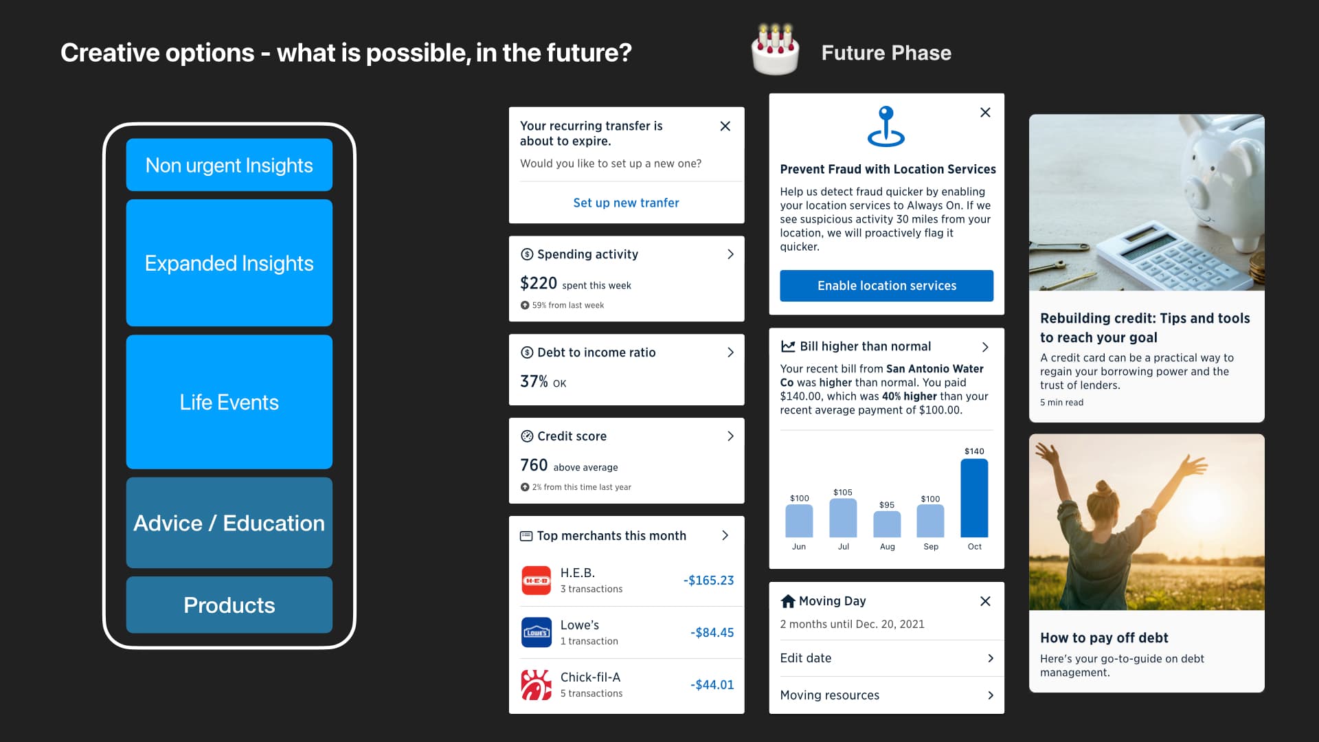
Then we explored the extremes: what could ship using existing cards, what a dedicated destination could unlock, and what a future orchestration platform might support. Designing “now” and “next” together let the minimum experience carry the architecture of the longer-term vision.

Complete decision-quality slide organizing insights by member priority, impact, effort, and time
A shared decision model aligned business and member priorities before the team committed to a UI direction.
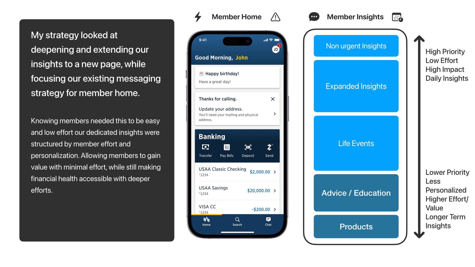
Complete slide mapping member priorities, immediate needs, and deeper financial-health engagement
The information architecture connected the member’s most immediate concerns to progressively deeper forms of help.
Complete slide showing feasible near-term financial insight concepts
Near-term: build with proven cards and existing delivery patterns.
Complete slide showing future financial insight concepts
Future: deepen personalization, orchestration, and financial-health guidance.

THE OPERATING RHYTHM

01Frame

Clarify the member decision, constraints, and value.

02Explore

Compare feasible and aspirational alternatives.

03Test

Use research where confidence is low and impact is high.

04Pilot

Measure behavior with controlled releases.

05Scale

Carry learning into the platform and roadmap.

Evidence moved the idea from possibility to commitment.

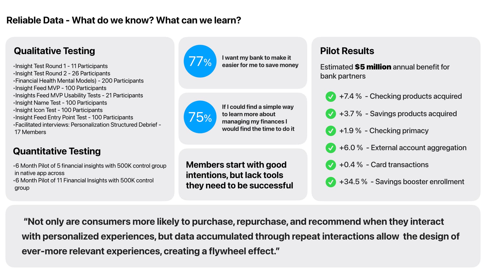
I coordinated qualitative research with more than 600 participants across mental-model studies, naming and icon tests, entry-point tests, MVP usability work, and facilitated interviews. Quantitatively, the team ran two six-month pilots with 500,000-member control groups.

The pilots estimated a $5 million annual benefit for Bank partners and showed gains across checking acquisition, savings acquisition, account aggregation, card activity, and savings-booster enrollment.

$5Mestimated annual benefit from only a fraction of the planned financial-health experience
Complete reliable-data slide summarizing qualitative research, quantitative pilots, and business results
Research reduced uncertainty; control-group pilots created the confidence to expand the experience.

The interface was only one part of the product.

The durable contribution was the decision system around it: a shared frame, explicit tradeoffs, repeatable research standards, and an operating rhythm that let multiple teams learn without losing momentum.

That is how a hackathon-scale signal became a funded platform direction—through visible rationale and progressive commitment, not a single presentation or perfect first concept.

NEXT CASE STUDY

Polycom Unified UI