Selected work
02

POLYCOM · ENTERPRISE COLLABORATION

One product language across a fragmented ecosystem

Customers experienced Polycom as one company. Its products behaved like many.

ROLEUX strategist · Global design-system lead
SCOPEMobile · Web · Cloud · Voice · Room systems
CONTEXTNorth-star strategy → system → working prototype
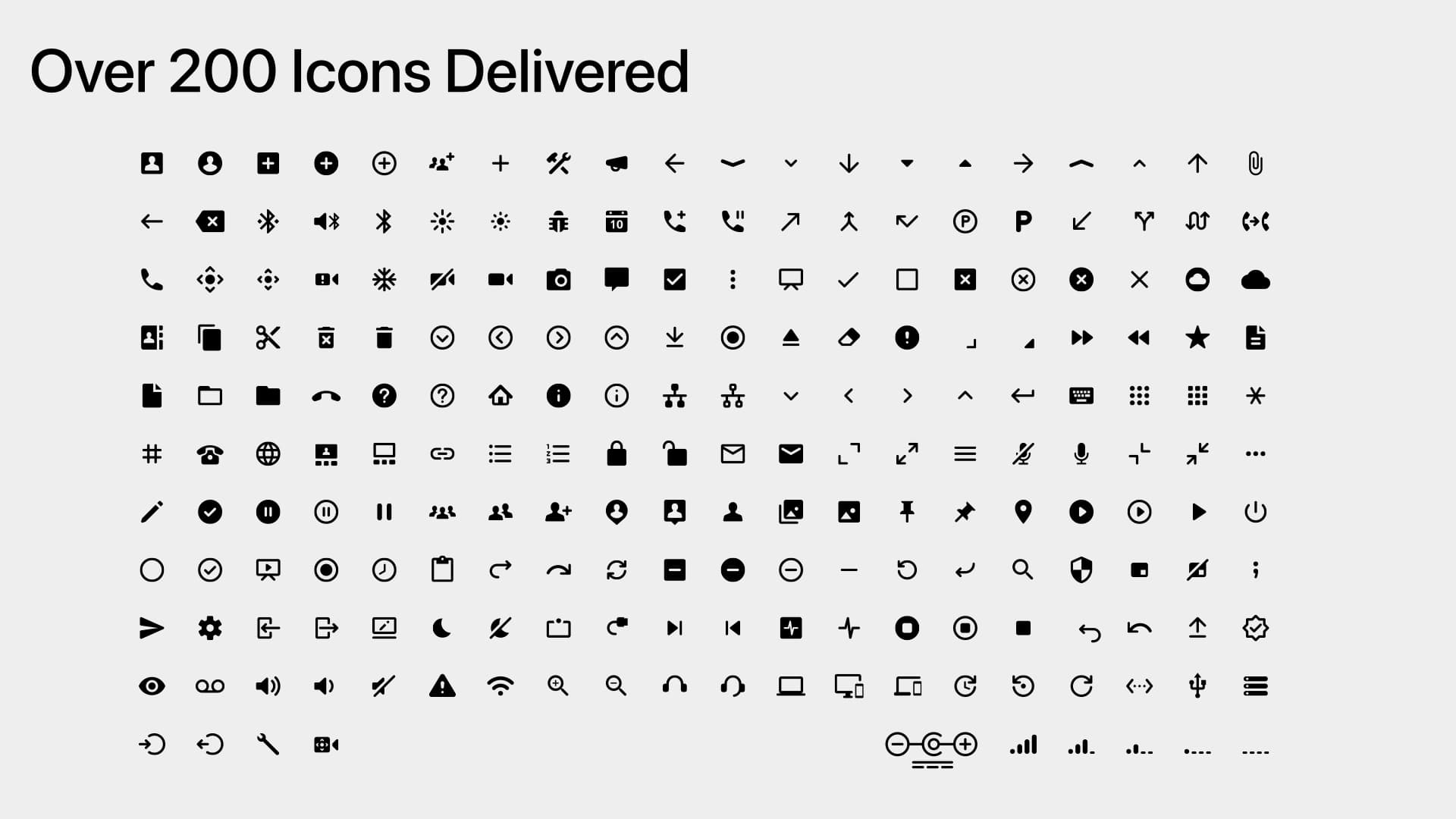
200+icons in the shared library
50+languages supported
TV → mobilecross-device system
$100M+annual opportunities supported by EBC

The portfolio shared a logo—not a mental model.

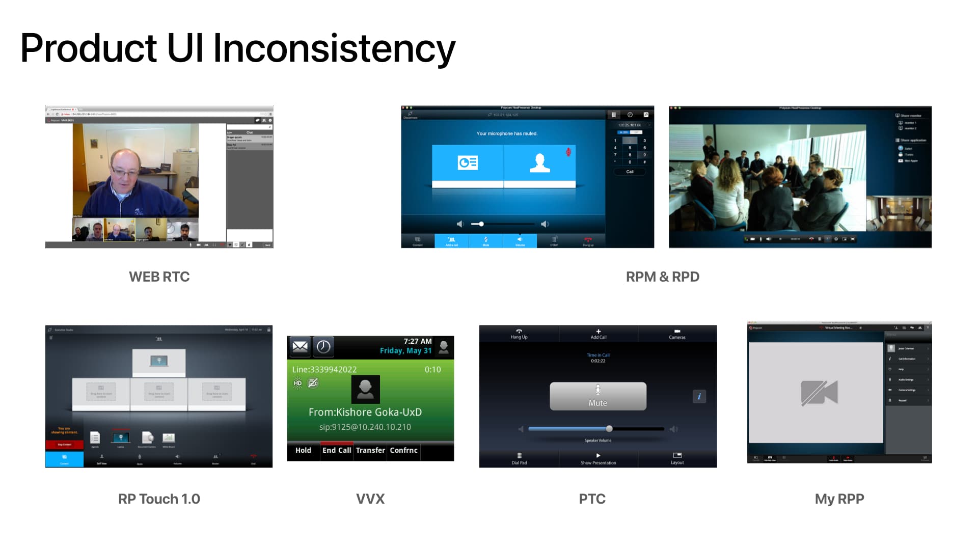
Polycom’s collaboration ecosystem spanned phones, mobile apps, browser experiences, cloud administration, touch controllers, voice interfaces, and immersive room systems. Similar tasks were solved differently across products.

Customers and sales teams asked a blunt question: “When will the products look like they come from the same company?” Internally, teams managed redundant PNG files, inconsistent controls, and disconnected roadmaps.
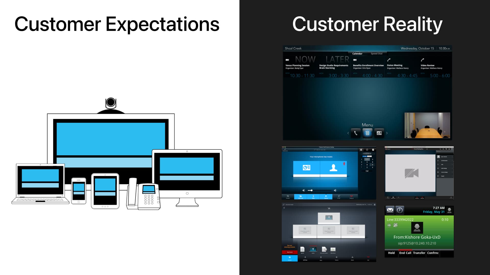
Complete Customer Expectations versus Customer Reality slide comparing a coherent ecosystem with disconnected Polycom products
The complete source slide makes the gap explicit: customers expected one ecosystem but encountered locally optimized products.

Create a north star without asking every product to start over.

I was responsible for defining product-design strategy across the portfolio. A wholesale redesign was neither technically feasible nor organizationally credible, so the path had to create visible value early while building commitment for deeper change.

I audited user flows, color, iconography, labeling, tool order, and common call tasks; interviewed product and sales leaders; and mapped changes by impact, effort, and risk.

The strategy: start with a shared visual language, then progressively align behavior around customer mental models.

A small first move created ownership for a much larger one.

Iconography was the right wedge: high customer impact, comparatively low implementation effort, and a practical way to learn how cross-product governance should work.

Using Polycom’s principles of precision, honesty, and simplicity, I built a geometric construction system with consistent line weights, spacing, and rounded forms. Marketing and product partners reviewed the work throughout; participation became investment, then ownership.

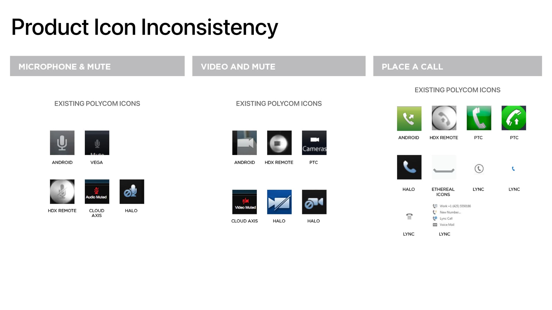
Complete slide showing inconsistent icon designs across Polycom products
Before: duplicated assets, conflicting metaphors, and inconsistent rendering.
Complete slide showing more than 200 icons in the unified Polycom system
After: 200+ reusable icons constructed from one visual grammar.

Mobile-first became the lever for cross-device consistency.

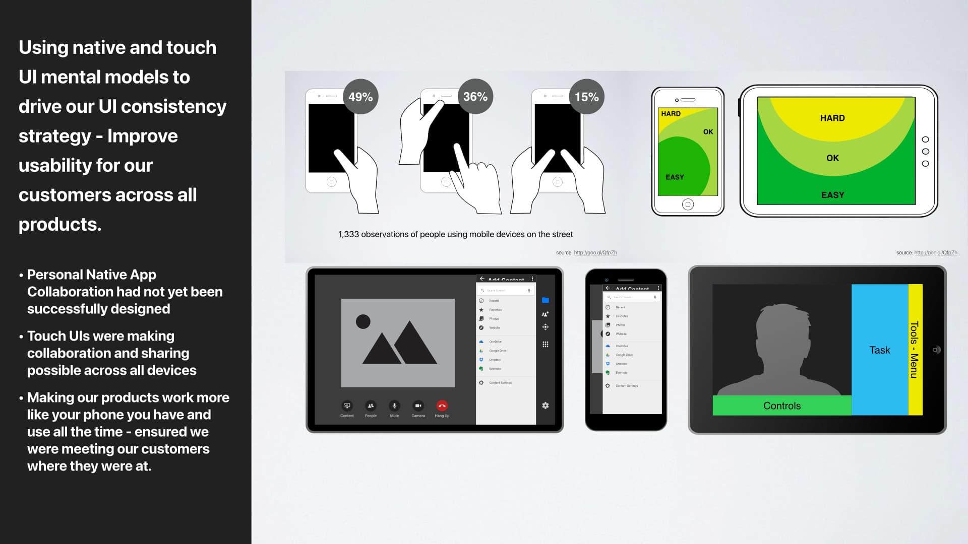
Room systems drove revenue, but their engineering-led interfaces did not scale well to personal devices. I argued that the smallest screen imposed the most useful discipline: fewer controls, clearer hierarchy, and flows that people already understood.

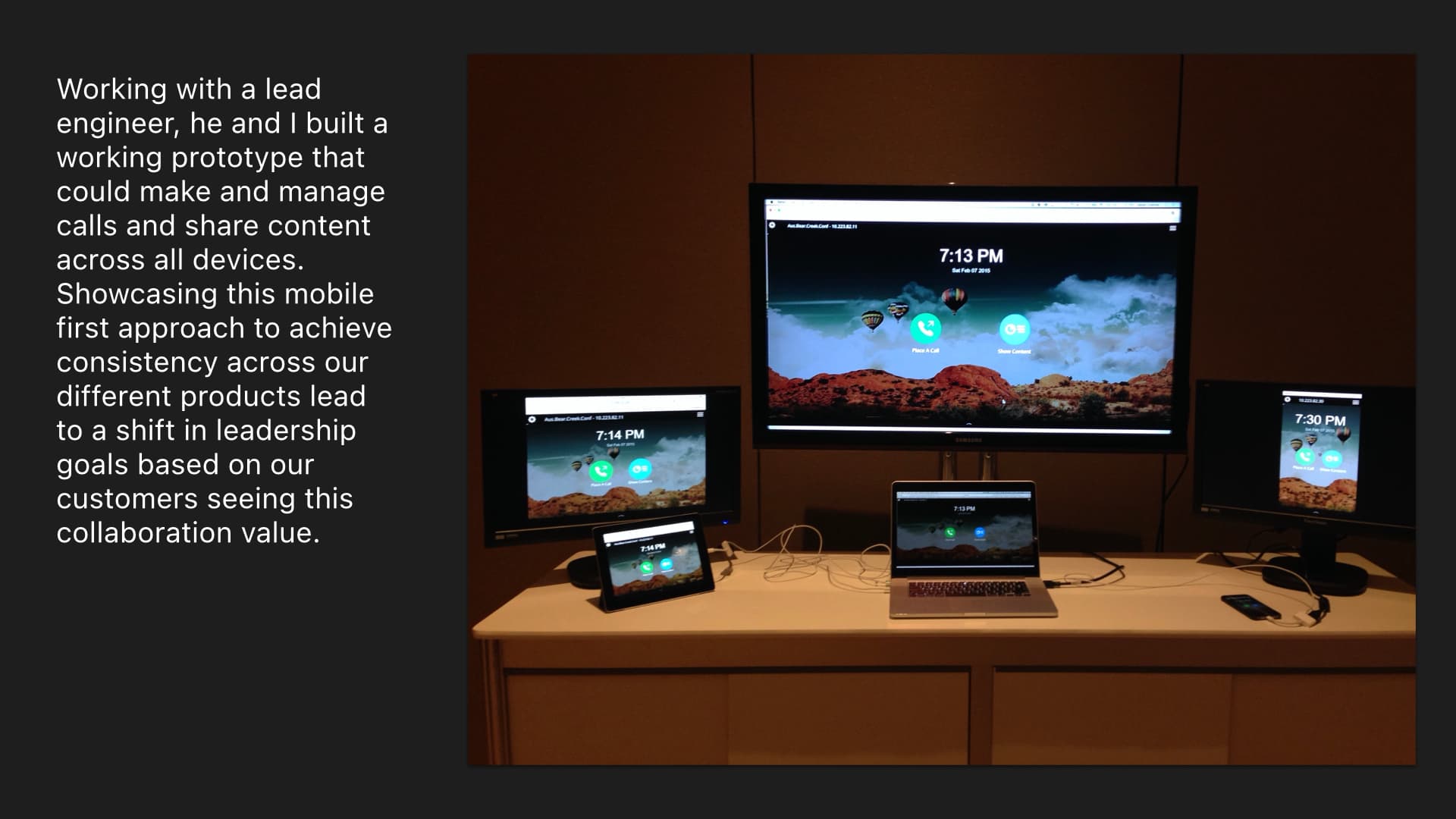
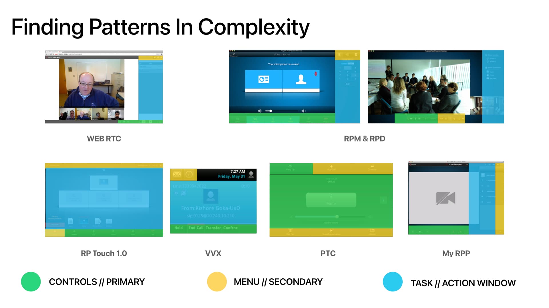
Across the existing products I found a repeatable structure—primary controls, secondary menus, and a task/action window. I worked with a lead engineer to turn that pattern into a functioning prototype that could place and manage calls and share content across devices.

Complete slide showing the mobile-first strategy across voice, touch, remote, and screen interfaces
Strategy: use the constraints of mobile and touch to simplify every endpoint.
Complete slide showing the strategy implemented across a conference-room ecosystem
Implementation: the same hierarchy adapted across personal and room products.
Complete slide comparing inconsistent Polycom controls, menus, and task areas
Audit: similar tasks were organized and labeled differently across the portfolio.
Complete slide showing recurring controls, menus, and task areas across product interfaces
Pattern finding: controls, menus, and task areas formed a reusable product model.
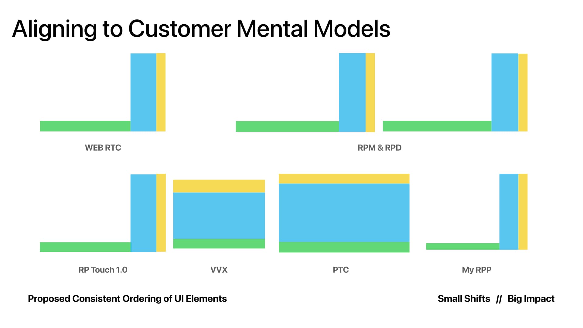
Complete slide aligning cross-device interface patterns to customer mental models
Alignment: the shared model adapted to each context without forcing identical screens.

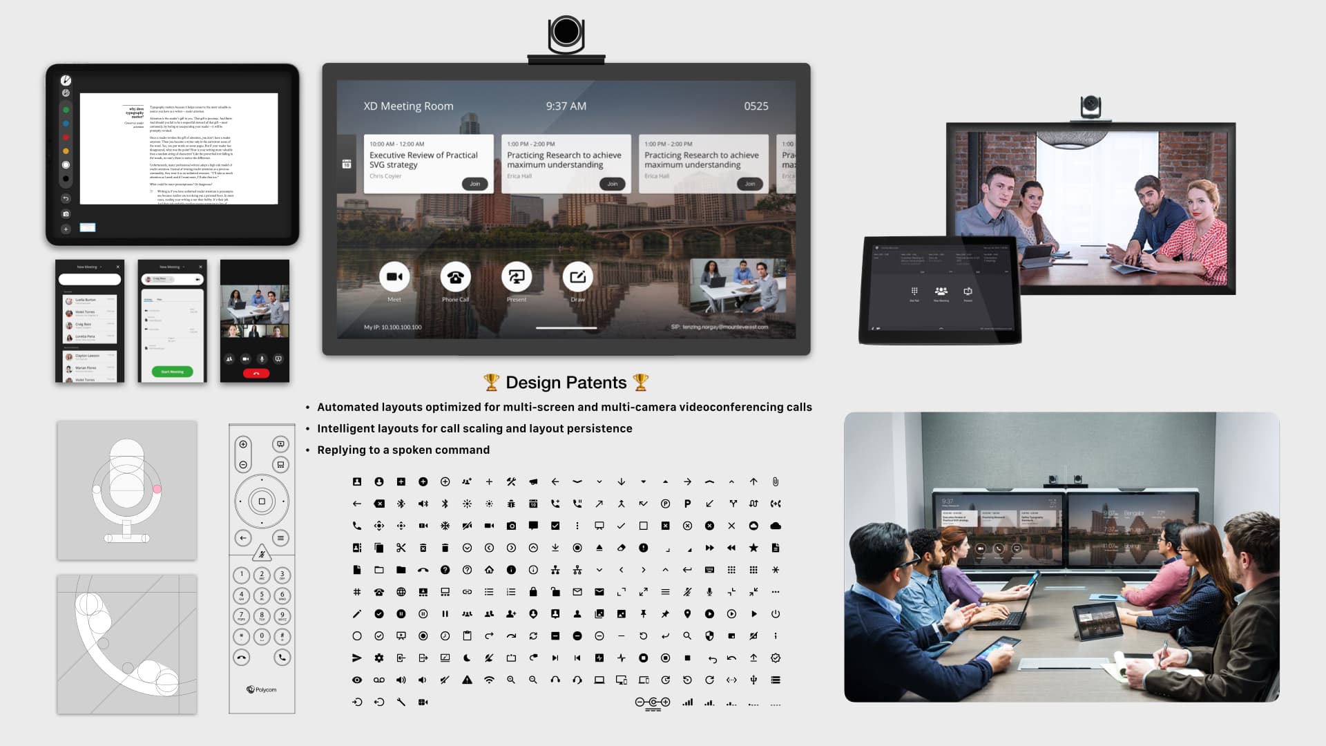
The system became real across TV, remote, mobile, touch, and room interfaces.

The most important proof was implementation. Finished concepts showed how the visual language, interaction hierarchy, and shared behaviors could improve interfaces across the ecosystem—from small personal screens to large, multi-display rooms.

The system was deliberately elastic: controls stayed recognizable, menus preserved orientation, and the task area adapted to the device, input method, and room context.

Complete slide showing the unified experience across room, mobile, web, and touch products
Cross-device implementation: one language, adapted by context.
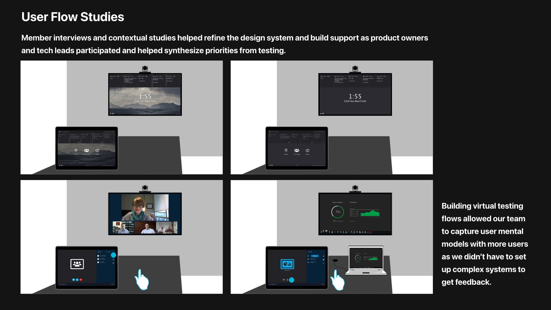
Complete slide showing user-flow studies across multiple Polycom device configurations
Flow studies ensured the system improved behavior, not only appearance.

The strategy moved from a design initiative to a portfolio direction.

The design system was adopted across phones, room systems, touch controllers, software, documentation, and marketing. The unified-UI research was presented globally by Polycom’s VPs of Engineering and Product Management.

The broader lesson was organizational: shared systems spread when teams can see their own constraints respected in the strategy—and when finished examples prove that the system can improve each product without erasing its context.

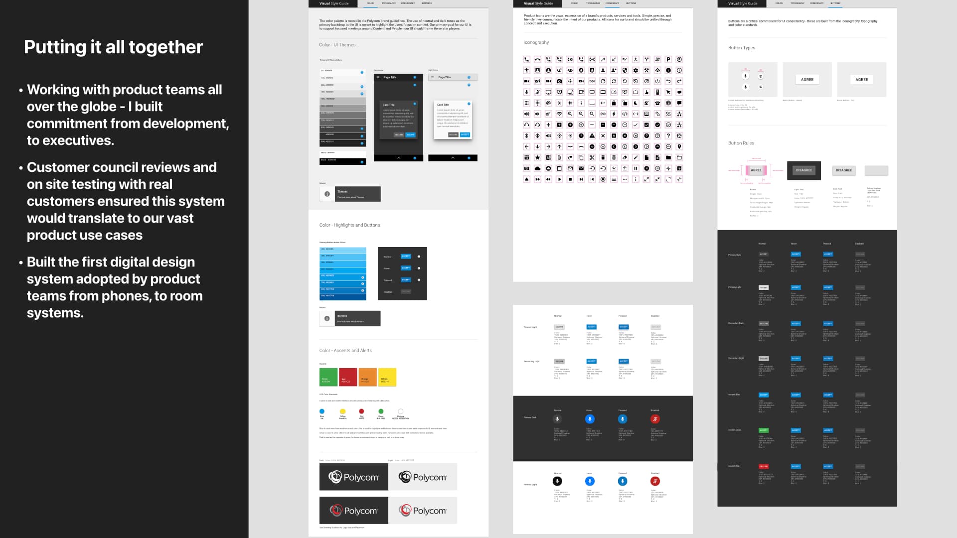
Complete design-system slide showing typography, color, components, icons, and interface examples
The finished system connected principles, components, icons, and product examples in one implementation reference.

Governance begins before the component library.

Standards only become a system when people trust the process that created them. The most important artifacts were not just icons and patterns, but the rationale, working examples, partner participation, and sequence of achievable commitments behind them.

NEXT CASE STUDY

Patented Collaboration Systems